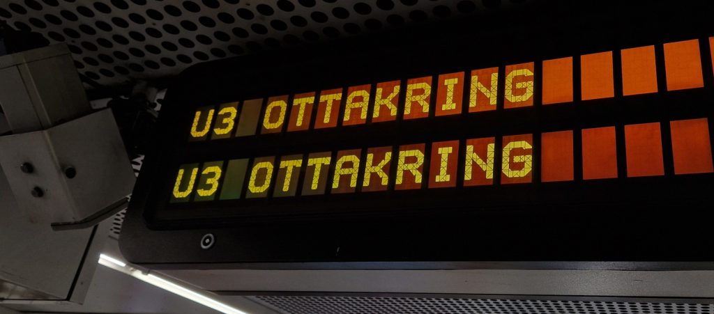
When I first was on the U3 subway in Vienna last year I noticed how many segments the characters have on these displays. It looked absurdly many, but I really liked the shape of the characters, so the next time when I was around I took a few pictures and started to draw it in Inkscape. I counted 84 segments in the end.

Needless to say, at this point I was already in love with these shapes. I was also joking about making a font out of it, but… well…
Creating the font
After looking around for a bit I found Birdfont, a free open source font editor. Checking out the Intro to Birdfont tutorial by Spencer Saunders was enough to get me started.
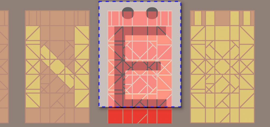
Birdfont has a few sample fonts but you can really open any TTF file with it. As I had no idea what would be the correct shape and dimensions in the SVGs, I have opened a TTF font and exported a wide and full height letter with accents (“Ë” in my case) and based my characters on its shape (although it turned out to be a bit too low in the previews).
Birdfont has a really great approach when importing the characters from SVGs. Basically you can import a directory containing one SVG per character with an easy to follow naming scheme:
- the base of the file name is the character to import (
C.svgwill imported as “C”) - everything after
#is treated as comment (C#v0.2.1.svgwill be “C”) - special characters (or anything, really) can be imported based on its Unicode codepoint (
U+<codepoint>.svg, soU+2e.svgwill be “.”,U+5b.svgwill be “[“)
It can also set the character width based on the SVG document size. These were my SVG Folder Import settings:
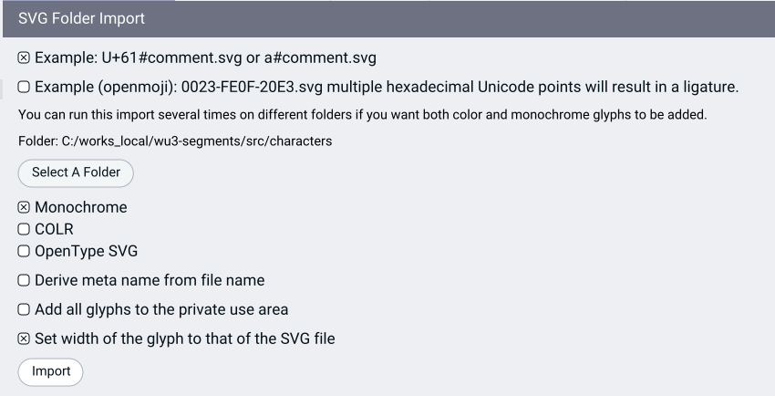
Although I had to manually unselect a few files, but that was just a few clicks.
It can also export EOT and SVG formats, the OTF is unfortunately a “plus version” feature. It can also tune spacing, kerning, ligatures, but I didn’t need these.
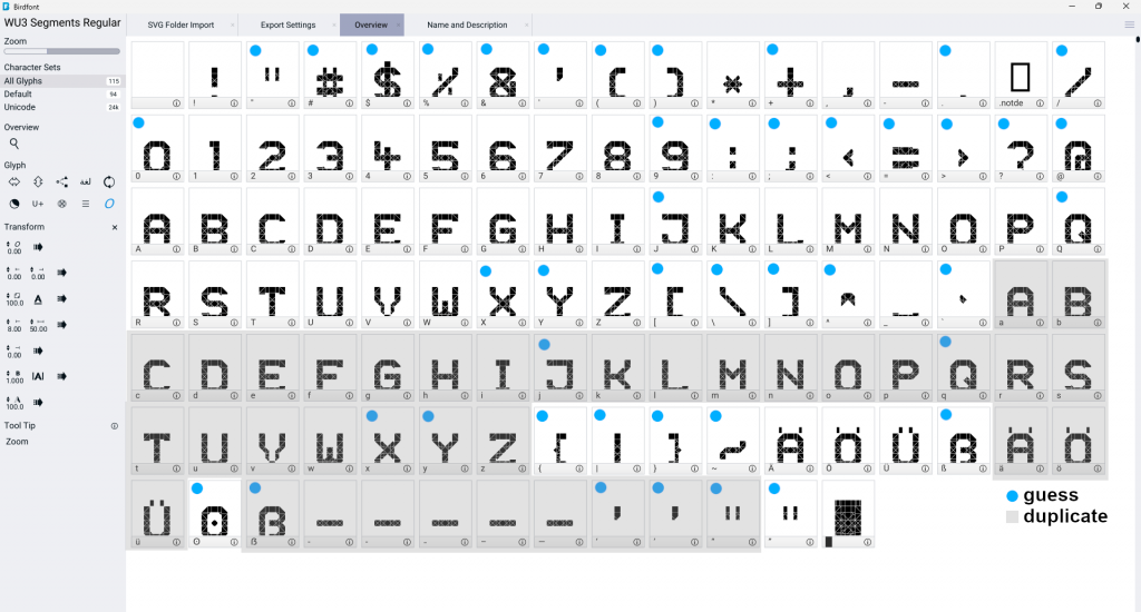
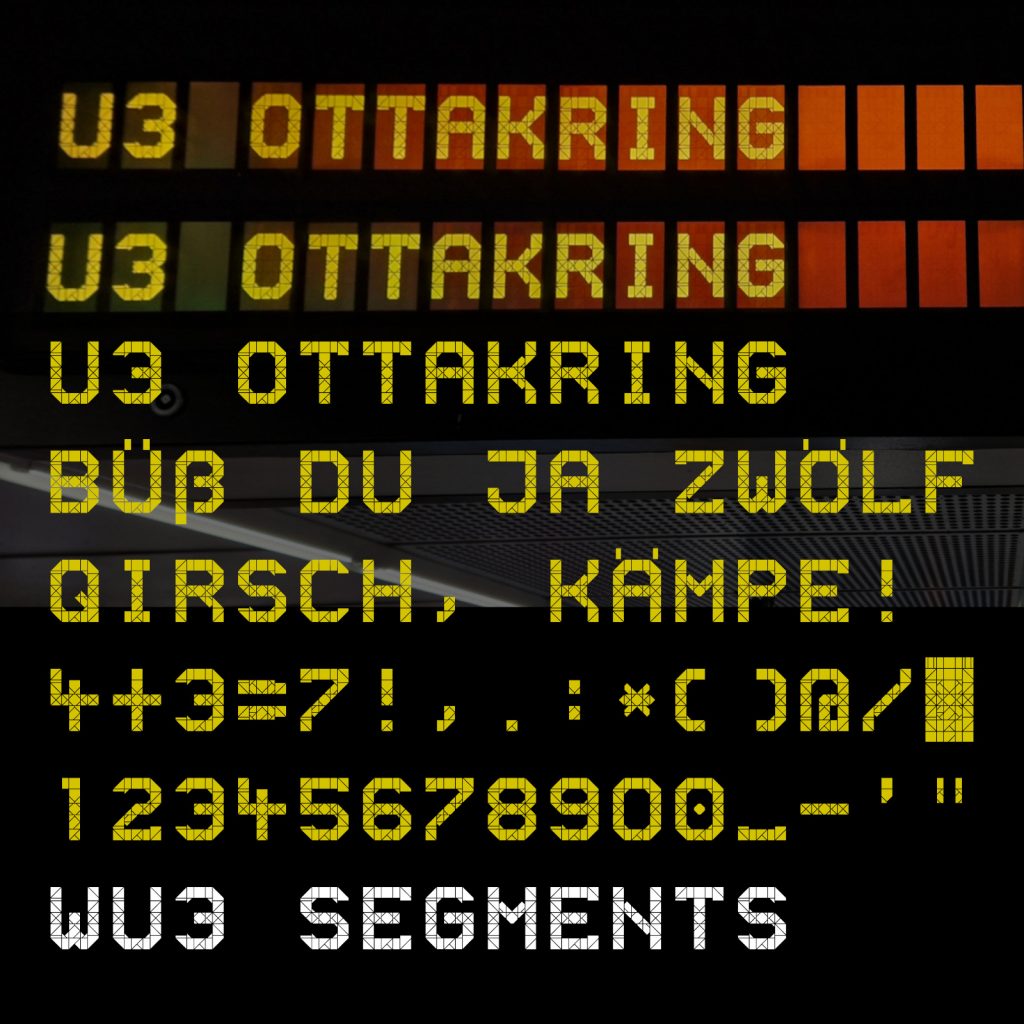
After making a few characters I exported a TTF to play around with. It looked great! So I added the rest of the characters I had a photo of and also found some photos online (see the Sources in the readme), and then guessed the rest of the characters based on these. The full character set as of v0.12 looks like this:
I did a side-by-side comparison with a photo and also a bit of a test run.
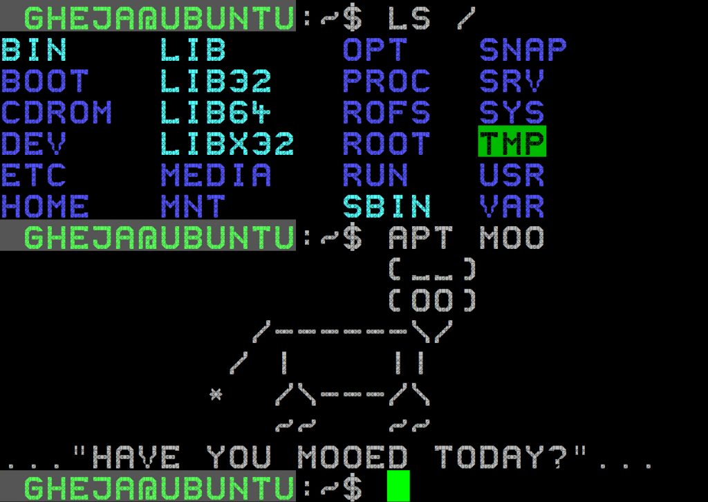
And well, I could not resist to try it in a terminal…
Downloading the font
I put everything in the wu3-segments GitHub repo, you can download the font files under the releases tab:
https://github.com/gheja/wu3-segments/releases/
Feel free to use it and I’d appreciate any feedback you might have!
Further?
At this point I thought the font was quite complete and I didn’t expect any major changes – except… derloris on Mastodon showed me two photos they took with lowercase letters displayed!
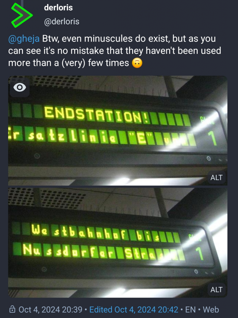
I did not expect this. Although they look a bit janky (the spacing is all over the place) now I feel the font is not quite as complete as I thought. And maybe now I should add these characters, too…
Some notes
Collecting all the characters needed for a font seems to be an impossible task, as only a few station names and the numbers are displayed, apart from occasional messages like “Use public transport, save the climate!” (“Öffis nützen, Klima schützen!”, which actually led to misbehave/crash the mobile apps and other connected services). So long story short, I had to guess several characters (surprisingly Q, X, Y are amongst those).
If you have any pictures of any letters that are missing or marked as guesses, I’d happy to update the font, see the About section of the readme for details.
Posting about it on Mastodon (okay, tooting is the correct verb) was a big part of kicking this project forward. Each of my posts about it got more and more positive reactions and encouragement: my first impressions, kind of joking about making a font, releasing the preview TTF font file, they all got great reactions.
Marcin Wichary made a really nice Segmented type appreciation corner webpage to play around with segmented fonts, I think you might like it.